| « カスタムツリービューの基本的な使い方(その5~ドラッグ&ドロップ) | カスタムツリービューの基本的な使い方(その7~プログレスバー) » |
カスタムツリービューの基本的な使い方(その6~複数列ツリー)


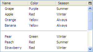
複数列ツリーを作成する。ベースとなるソースコードはその1~表示を参照。
fruits.xul
fruits.xul へ treecol 要素を2つ追加する。
        <treecols>
            <treecol label="Name" flex="1" primary="true" />
            <treecol label="Color" flex="1" />
            <treecol label="Season" flex="1" />
        </treecols>
fruits.js
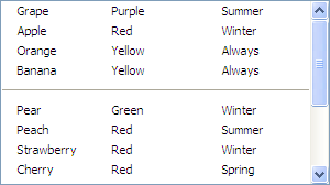
データ構造を一次元配列から二次元配列へと拡張する。
var gFruitsData = [
    ["Grape"     , "Purple", "Summer"],
    ["Apple"     , "Red"   , "Winter"],
    ["Orange"    , "Yellow", "Always"],
    ["Banana"    , "Yellow", "Always"],
    [null        , null    , null    ],    // separator
    ["Pear"      , "Green" , "Winter"],
    ["Peach"     , "Red"   , "Summer"],
    ["Strawberry", "Red"   , "Winter"],
    ["Cherry"    , "Red"   , "Spring"],
    ["Melon"     , "Green" , "Spring"],
    [null        , null    , null    ],    // separator
    ["Watermelon", "Green" , "Summer"],
    ["Plum"      , "Purple", "Summer"],
    ["Papaya"    , "Yellow", "Always"],
    ["Lemon"     , "Yellow", "Always"],
];
nsITreeView#isSeparator, getCellText を以下のように修正する。
    isSeparator: function(index) {
        return this._data[index][0] == null;
    },
    getCellText: function(row, col) {
        switch (col.index) {
            case 0: return this._data[row][0];
            case 1: return this._data[row][1];
            case 2: return this._data[row][2];
        }
    },
応用例1~ツリーカラムを非表示にする~
複数列ツリーに限った話ではないが、ツリーカラムを非表示にするためには、以下のように tree 要素へ hidecolumnpicker 属性を追加し、各 treecol 要素の label 属性を削除した上で hideheader 属性を追加する。
    <tree id="fruitsTree" flex="1" hidecolumnpicker="true">
        <treecols>
            <treecol flex="1" hideheader="true" primary="true" />
            <treecol flex="1" hideheader="true" />
            <treecol flex="1" hideheader="true" />
        </treecols>
        <treechildren flex="1" />
    </tree>
応用例2~列の順番を変更できるようにする~
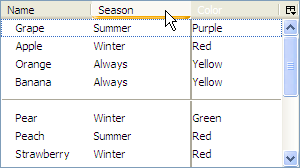
以下のように tree 要素へ enableColumnDrag 属性を追加すると、列をドラッグ&ドロップで順番を変えることが可能になる。
<tree id="fruitsTree" flex="1" enableColumnDrag="true">
応用例3~列の幅を調整できるようにする~
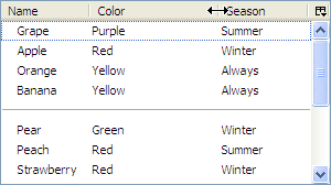
以下のように treecol 要素間に splitter 要素を挿入すると、列の幅をドラッグ&ドロップで調整することが可能になる。
    <treecol label="Name" flex="1" primary="true" />
    <splitter class="tree-splitter" />
    <treecol label="Color" flex="1" />
    <splitter class="tree-splitter" />
    <treecol label="Season" flex="1" />
応用例4~列の表示状態を保存する~
以下のように各 treecol 要素へ id と persist 属性を追加すると、各列の表示/非表示(カラムヘッダ右端のピッカーから変更可能)、順序(応用例2にて変更可能)、幅(応用例3にて変更可能)といった表示状態が localstore.rdf へ保存され、次回 fruits.xul をロードしたときに自動的に復元されるようになる。
    <treecol id="fruitsName" persist="hidden ordinal width" label="Name" flex="1" primary="true" />
    <splitter class="tree-splitter" />
    <treecol id="fruitsColor" persist="hidden ordinal width" label="Color" flex="1" />
    <splitter class="tree-splitter" />
    <treecol id="fruitsSeason" persist="hidden ordinal width" label="Season" flex="1" />
関連記事
- カスタムツリービューの基本的な使い方(その1~表示)
- カスタムツリービューの基本的な使い方(その2~追加・削除)
- カスタムツリービューの基本的な使い方(その3~インライン編集)
- カスタムツリービューの基本的な使い方(その4~並び替え)
- カスタムツリービューの基本的な使い方(その5~ドラッグ&ドロップ)
- カスタムツリービューの基本的な使い方(その6~複数列ツリー)
- カスタムツリービューの基本的な使い方(その7~プログレスバー)
- カスタムツリービューの基本的な使い方(その8~チェックボックス)
- カスタムツリービューの基本的な使い方(その9~階層構造 – 表示)
- カスタムツリービューの基本的な使い方(その10~階層構造 – フォルダ開閉)